The Problem With Most Gym Websites
Most gym websites are built by web designers who've never run a gym. They optimise for looks (hero videos, parallax scroll, design awards) instead of conversions. The result is pretty sites that get thousands of visits and book three trials a month.
Here's what actually makes a gym website convert — based on sites we've built and rebuilt for Australian gyms in 2026.
The One Question Every Gym Website Must Answer
When someone lands on your site, they're asking one question: "Is this gym for me?" Everything else is decoration. Your homepage has about 4 seconds to answer that before they bounce.
Want the full Local SEO + Google Ads system run for your gym? We build and manage it for $2,500/month, no lock-in after the first 3 months.
See the Gym Marketing Service"For me" means three things specifically: do I fit your members? (demographic match), do you do the kind of training I want? (method match), can I afford it? (price match). If your hero section doesn't answer those three questions, your site is already losing.
Hero Section: What Converts
The hero section needs a one-line promise, a photo of your actual gym (not stock), and a clear primary CTA.
Examples of one-line promises that convert for different gym types: - "Strength and conditioning coaching for women over 40 in Sydney's Inner West." - "Semi-private personal training for busy Melbourne professionals. 3 sessions a week, $89." - "Community-first CrossFit in Bondi. 6 classes daily, 6am–7pm."
Notice: none of them say "transform your life" or "become your best self." Those are warm-up phrases for ads. On a website, you want to be specific — your target member should read the hero and think "that's me."
CTA: one button, one destination. "Book a free session" or "Claim your 7-day pass." Not three buttons competing for the click.
The Five Sections That Actually Matter
After the hero, the sections that move the needle are:
- Who this is for. A "Is this for you?" section listing 3–4 specific member types you serve. "First-time lifters," "postnatal rebuild," "sport-specific prep." This is filtering — you want bad-fit leads to self-select out.
- How the training works. A specific description of your method, not fluff. "Small group, 8 members per class, 45 minutes, led by a qualified coach, based on 5/3/1 linear progression." Specifics convert. Vague doesn't.
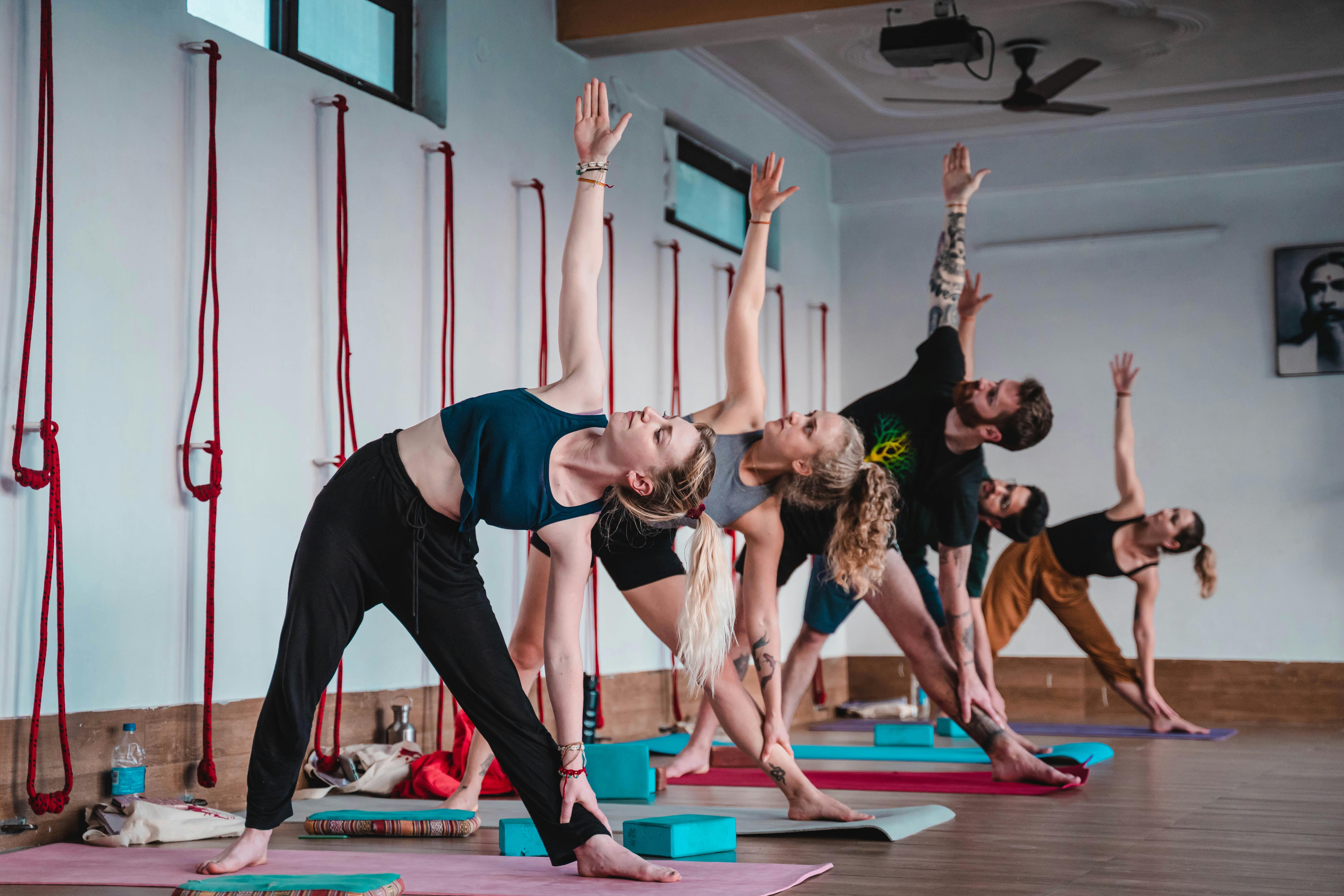
- Member results. Real member photos (with permission), real quotes. Not testimonials from "Sarah, Mum of 2" with a stock headshot. If you can't get permission for real photos, skip this section entirely rather than faking it.
- Pricing. Yes, on the site. Every gym wants to "get them on a discovery call" and hide pricing, and it costs them 40% of qualified leads. Show pricing. Show the trial offer. Bad-fit leads filter themselves out, good-fit leads book.
- Trust signals. Google Business Profile rating embedded, Facebook rating, industry credentials (coaches' certifications), 3–5 real photos of the space.
The Booking CTA
The biggest conversion killer is a "Contact Us" form instead of a booking flow. People don't want to email a gym and wait for a reply. They want to book a session or claim a trial right now.
Use Calendly, Acuity, or Mindbody's booking widget embedded directly on the site. Remove "Contact Us" as the primary CTA. Replace with "Book a free session" that goes straight to a calendar.
If you must have a form (some gyms prefer gating trials with a quick qualification question), keep it to 3 fields max: name, phone, what they want help with. Every additional field drops conversions by 5–10%.
What to Skip
Things gym websites commonly include that don't convert:
- Autoplay hero video. Loads slowly, most users mute it or scroll past. Use a static hero image instead.
- Long founder bio on the homepage. Move to /about. Members don't care until they're close to converting.
- Blog-first homepages. Unless you're specifically running content marketing, burying your CTAs under blog previews is a conversion mistake.
- 10-point navigation menus. Primary nav should be 4–5 items max: Classes/Training, Pricing, About, Book. That's it.
- "Our Philosophy" section on the homepage. Nobody who's comparing gyms cares about philosophy in the first 30 seconds.
Mobile First, Loading Speed Next
70%+ of gym website traffic is mobile in Australia. If your site doesn't load in under 2 seconds on a 4G connection, you're losing half your potential bookings before they see the page.
Use Next.js or a fast static stack (Astro, Webflow with aggressive caching). Don't use slow WordPress themes stuffed with plugins. Test on PageSpeed Insights monthly — aim for 90+ mobile score.
A Real Conversion Example
A CrossFit box in Melbourne had a website built by a generic agency — beautiful design, autoplay video hero, contact form, no pricing shown. 3,100 visitors a month, 4 trial bookings.
We rebuilt it: static hero image of the actual box, one-line promise ("Community-first CrossFit in Brunswick — 6 classes daily"), pricing shown above the fold, Calendly embed for trial booking, real member photos, Google reviews embedded. Same traffic.
After 60 days: 38 trial bookings per month from the same 3,100 visits. No paid promotion changes — just a rebuilt site.
What to Do Next
If you need a new gym website, we build them at Digital Edge Studio as part of the broader gym marketing service. If you want web design specifically (standalone, not bundled with SEO/Ads), see /web-design-gyms. Sydney-specific gym marketing is at /gym-marketing-sydney.